Steampunk to Starships: Workshop Summary

Last week I was lucky to work with a great team of folks to talk about using pop culture in the museum world: its successes, pitfalls, opportunities, and risks. The workshop was organized through the auspices of the New England Museum Association, and we were hosted by the fantastic staff of the Charles River Museum of Industry and Innovation in Waltham, MA.

IMG_20160413_125508124

The bike path along the Charles River in Waltham runs right along the front of CRMII

The workshop covered a lot; not just the whys and hows of integrating pop culture, but also discussing the rewards of taking risks, identifying partners in collaborative projects, and case studies in exhibit and festival design. We also got into some good and meaty topics right at the end of the day, which I’m looking forward to continuing when we do a follow up session at the NEMA conference this November.

Why Use a Pop-Culture Hook?

Mission is key, but pop culture (or anything else with a devoted following of fans) can be a great hook to bring in new audiences, or to give your current visitors a way to connect with your collections and mission differently.

There are a lot of different ways to use pop culture tie-ins, depending on the level of time, money, and staff energy that you have available. Listed below are some of the examples I used in my presentation (and a few I didn’t manage to include):

Exhibits (High investment of time, budget, and staff)

Exhibit ‘overlays’ or interventions (moderate to low investment of time, budget, and staff, depending on if your staff is doing the intervening or if you’re working with outside artists, students, etc.)

Activity Guides (moderate to low investment)

Special Events and Programs (moderate to high investment, depending on the size of the event)

In all of these examples (though least of all exhibits, which usually are their own draw), timeliness is an important factor. It’s really easy to hop onto a wave too late, or to leave insufficient time to work with the other departments in your museum to get on their project calendars for design, marketing, or fabrication. For instance, I once wrote a really cool activity guide tying the Peabody Essex Museum collections to locations and events in Middle Earth around the time the first Hobbit movie was coming out, but it coincided with a massive workload for the creative services team at the museum, who were swamped by an upcoming exhibit and had no time to design the guide. Thus, it never materialized.

This is outside my institution’s comfort zone. Why take the risk?

Exhibit designer Margaret Middleton (@magmidd) led us all in a series of exercises to help identify our own sense of risk-taking.  Were we risk-takers or risk-averse? Were we risk-enablers for others in our institutions? What topics could be considered low-risk or high-risk for a program or exhibition? In a different context, would the risk level be different?

She also strongly suggested that ‘risk’ is the wrong end of the stick. While being aware of potential hazards (and taking steps to mitigate them) is important, Margaret suggested that we should reframe these opportunities as ‘potential rewards’ instead of risks. What happens if you let a seven year old use real, sharp tools? What  happens if you host that conversation on voting rights in modern America? What’s the harm in tweeting an article about climate change if your museum has an upcoming show about the Arctic & Antarctic? How much negativity are you ready for, and how will you deal with it? Can you point to all your decisions being mission-driven, and if so, what’s the risk, really?

One important opportunity in both risk-taking and risk-mitigation is to invite outside voices into the museum process, as advisors, local or content experts, and enablers. Margaret offered up this worksheet as a way to identify who can help fill the holes in your project development team.

IMG_20160413_140048506

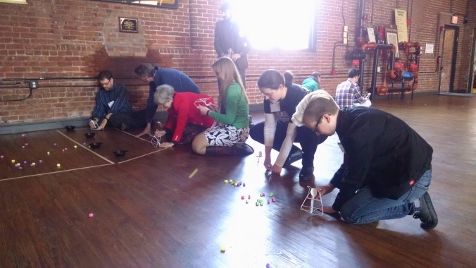
Workshop participants test their Coat Hanger Catapults (because everyone needs a good catapult activity, it ties in to so many themes!)

This sounds exciting, but where do I even start? My collection is huge and pop culture’s even bigger.

This is where calling on your friends and family, coworkers, local librarians and booksellers, and the internet can help. Everyone has a passion, which usually comes with insider knowledge: book and movie release dates (helpful with the timeliness factor aforementioned), connections to specific communities like book groups, crafting circles, or fan conventions, etc.

You can start with some of the topics listed in the slideshow above under “geekstorming activity” as well. Some are specific and time-sensitive (Hamilton is the hot new thing on Broadway that’s getting attention from lots of previously-non-theater-goers), others are more general (board and video-games are perpetual favorites as a broad topic). Then use this worksheet (geekstorming template) as a visual way to tie the objects or strengths of your institution, plus people in your circles who might be able to help you, to specific topics.

Case Studies and Take-Aways of Exhibits and Festivals

In the afternoon, museum consultant Emily Robertson told us about her work with the Star Wars: Science Meets the Imagination exhibition produced by the Museum of Science, Boston, and Nick and Jillian Perry, the founding artists of Emporium 32, spoke with Bob Perry of CRMII about the triumphs and pitfalls of running a large town festival with niche appeal, the Watch City steampunk festival.

Emily’s major takeaways from the development of a huge project like Science Meets the Imagination were as follows:

  1. Don’t be afraid to ask for what you want. You never know who’s going to say yes.
  2. Keep your mission in mind. The educational goals are what’s important, and what will defend against the nay-sayers.
  3. Listen to the fans (but plan for non-fans as well!).

Nick, Jillian, and Bob offered up this advice for planning festival-type events:

  1. Expect that your audience and returns will build over a series of years; plan for it. Don’t expect immediate success.
  2. Work with the community you want involved throughout the year, not just when you want them to turn up/volunteer at your event. Host meetups, offer other ways for them to greet and engage with each other and your institution.
  3. Recognize that a big festival event is a huge time commitment; plan for having staff or a paid outside coordinator; volunteer coordinators can be great, but not always as reliable as you want.

IMG_20160413_130758079

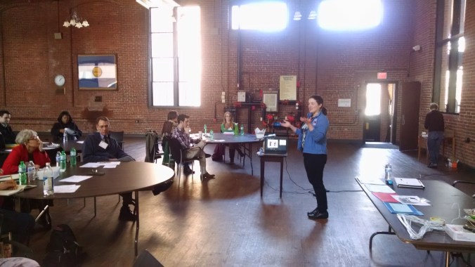
Emily Robertson talks about bringing hovercraft, droids, and hyperspace to real life at the Museum of Science.

Further Topics for Discussion

Right at the end of the day we touched on some interesting topics to hopefully explore further at the NEMA Conference in November. Here are a couple of questions to consider, and I’d love your input in the comments below!

  • A lot of ‘pop culture’ (including past classics that are still popular) is very mainstream/white/Eurocentric/majority-dominated. How can museums help widen the discussion and give space to other voices and stories while using more familiar pop culture as a hook to bring people in?
  • “High” vs. “low” culture: is this still a thing? What are the arguments we can use with our curators/board & trustees/unconvinced coworkers that prove all art is in dialogue and that pop culture is worth the perceived ‘risk?’


Exhibit Review: The Science of Pixar at the Museum of Science, Boston

I will freely admit I am a Pixar fan. I also volunteered once upon a when at the Museum of Science, back when I was in high school and didn’t know museums were eventually going to take over my professional life. I have to believe, however, that even if neither of these things were true, I would still be really impressed with this exhibit.

We did not enter at 12:20. We entered at 9:20, and this is when we were leaving.

We did not enter at 12:20. We entered at 9:20, and this is when we were leaving.

I can never decide whether I love or hate timed-entry shows; as I’m usually an early-bird, it’s nice to know that I’ll have a little time with lots of space and chances to play with the interactives before things get crowded, but I am not sure how much it helps with traffic once the exhibit gets busy later. (Anybody know if someone’s done a crowd-pattern study on timed vs. untimed entry?)

There’s a lot to like initially on entry: there are a fun set of facts to read if you’re stuck waiting in line, and the entry movie is cool as much for the behind-the-scenes peek at the Pixar offices as it is for the intro to the steps of the computer-graphic-animated-movie-design process. (I especially loved the office that looks like the fuselage of an old plane wreck in the jungle.)

Once inside, as dark as the walls are, it still feels lightsome, as there are big gorgeous graphics of Pixar concept art all over, life-size models of various familiar characters, and brightly lit interactive islands throughout. I’m not a fan of the dark-hall design in general, so I was impressed at how not-dark this one was.

Logistical and Floorplan Choices

This is an exhibit that doesn’t really have an A-B-C flow; given the amount of bouncing around one has to do to find a free monitor or interactive once it gets busy, that’s a good thing. It is initially a little hard to figure out, but once you hit the ‘process in the round’ area that shows you how often elements of a movie move back and forth between the steps (from character design to rendering to animation to sets back to character design and then to lighting, for example), it makes the forth-and-back of the exhibit ‘map’ less troublesome.

I’ll cover interactives in depth next, but from the logistical standpoint they made some excellent choices. Most interactives were in sets of 2-4, so that each island had multiple opportunities for people to play, reducing waiting time and also making the overall density of the exhibit less overwhelming (“oh, these three are all the same, good, I can move on to the next thing”). There was also nice variety in the interactives; some low-tech in amidst all the high-tech, some very simple and others quite complicated, some large-scale that made it easy for multiple people to see/interact together, and some that rewarded close individual attention. There was something to appeal to almost every kind of learner, and several things which were clearly designed with universal accessibility in mind.

Interactives

There were a number of choices I admired in the interactive design of this show. The digital effects were almost always paired with a nearby example of how such a concept works in ‘meatspace,’ and the controls were on the whole intuitive and remarkably sturdy. (I don’t want to know how much programming turns sliding knobs and a choice of less than 5 buttons into easily digestible visible changes on screen, but I am willing to be impressed even without knowing the ‘how.’)

All the screens were captioned, and all the signs had audio wands. Several of the interactives had tactile handles that were the physical embodiment of the shape you were generating on screen. In terms of design for accessibility, I thought this exhibit did really well.

The only time I thought their physical-embodiment of something being described on screen *didn’t* work was in the reconstruction of the coil-within-coil physics of Merida’s hair. The two sets of springs they modeled were equally non-springy, and didn’t really emulate the physics being illustrated at that station. I wanted some dangling slinkies to play with of different materials and construction, instead of standing coils that didn’t move. Otherwise, the physical/virtual pairings were quite impressive.

This station allowed you to play with camera angles from several different cameras, and also allowed you to physically climb underneath for a literal bug's eye view of the constructed set. Simple, effective, great presentation value, and a nice way to tie in both the research Pixar did ahead of A Bug's Life and the directorial choices available when all your cameras are virtual.

This station allowed you to play with camera angles from several different cameras, and also allowed you to physically climb underneath for a literal bug’s eye view of the constructed set. Simple, effective, great presentation value, and a nice way to tie in both the research Pixar did ahead of A Bug’s Life and the directorial choices available when all your cameras are virtual.

A recreation of the paper house that Pixar lighting designers created to test lighting of Carl's house for Up. Behind this were digital interactives that let you play with the virtual lights the same way one could play with physical ones here. There was lots of cool context about the vocabulary of lighting design (ie 'temperature,' etc.) as well as the purpose (emotional effect, helping to pick out the main character in a scene, indicating transitions).

A recreation of the paper house that Pixar lighting designers created to test lighting of Carl’s house for Up. Behind this were digital interactives that let you play with the virtual lights the same way one could play with physical ones here. There was lots of cool context about the vocabulary of lighting design (ie ‘temperature,’ etc.) as well as the purpose (emotional effect, helping to pick out the main character in a scene, indicating transitions).

This was the low-tech version of mapping a surface onto a wireframe object. There was a very simple (frustratingly so, for adults) virtual interactive that allowed you to 'paint' a car hood with different projections, but I actually liked this better, for any number of reasons including the fact that different surfaces on the same shape create very different objects, and because it showed at least a little what kinds of deformations and folds you need to make in a surface texture when putting it on a 3D object.

This was the low-tech version of mapping a surface onto a wireframe object. There was a very simple (frustratingly so, for adults) virtual interactive that allowed you to ‘paint’ a car hood with different projections, but I actually liked this better, for any number of reasons including the fact that different surfaces on the same shape create very different objects, and because it showed at least a little what kinds of deformations and folds you need to make in a surface texture when putting it on a 3D object.

This animation station was one of the few where it helped to have paid attention earlier in the exhibit, to the 'rigging' section. It focused more on speed and range of motion, but was also influenced by the rules of how the character's arm moved, based on the virtual bones and flexibility it had already been given.

This animation station was one of the few where it helped to have paid attention earlier in the exhibit, to the ‘rigging’ section. It focused more on speed and range of motion, but was also influenced by the rules of how the character’s arm moved, based on the virtual bones and flexibility it had already been given.

I loved this. It required teamwork, it had enough variability that even though the arc of the jumping lamp was prescribed, the attitudes and 'energy' of the lamp were all adaptable, and it led to a lot of discussion (albeit also some frustration from impatient parents). The replay function was also very satisfying, as your 'movie' was over very fast!

I loved this. It required teamwork, it had enough variability that even though the arc of the jumping lamp was prescribed, the attitudes and ‘energy’ of the lamp were all adaptable, and it led to a lot of discussion (albeit also some frustration from impatient parents). The replay function was also very satisfying, as your ‘movie’ was over very fast!

This was one of the interactives where I thought the handles for controlling the interactive were more interesting than the activity itself. Each handle was the same shape as the line on the screen which one rotated to make a 3D shape. Very clever!

This was one of the interactives where I thought the handles for controlling the interactive were more interesting than the activity itself. Each handle was the same shape as the line on the screen which one rotated to make a 3D shape. Very clever!

A simple and very familiar interactive (assemble magnetic body parts, this time for robots) with new context; using a certain number of base parts, Pixar designers could generate X number of unique robot combinations (and therefore how many can you?) Context is everything, and some good ideas stay good, even if they feel like they've been done to death.

A simple and very familiar interactive (assemble magnetic body parts, this time for robots) with new context; using a certain number of base parts, Pixar designers could generate X number of unique robot combinations (and therefore how many can you?) Context is everything, and some good ideas stay good, even if they feel like they’ve been done to death.

Telling the Story

At heart, I’m a story person. Pixar is very good at story, of course, and fortunately, this exhibit does a pretty good job of it as well, especially in letting individuals who work at Pixar tell their stories. As much as I enjoyed the interactives (especially before it got too busy!), I really responded to the video interviews with people of all ages, ethnicities, and backgrounds who work at Pixar. They talked about loving or hating math at school, how they got interested in art or computers or both, their geeky hobbies, the ways their jobs and their coworkers inspired them, and generally put not just one human face on the movie making process, but dozens of them. It was adorable and inspiring and hilarious and eyebrow-raising in turns, and it made for good storytelling.

The process of creating Pixar stories, however, was a little muddled. The emphasis of this exhibit was more on the how-it-all-gets-built and not on how-it-all-begins or how-it-all-fits-together, but I did wish for a little more on the inspiration/imagination at the start of the process.

This circular exhibit element allowed you to track the evolution of a scene through the elements of the design and implementation process, but while visually engrossing was a little short on the 'concept and storyboarding' section.

This circular exhibit element allowed you to track the evolution of a scene through the elements of the design and implementation process, but while visually engrossing was a little short on the ‘concept and storyboarding’ section.

A Few Lingering Wishes

The biggest thing missing from this exhibit, my traveling companions and I all agreed, was that there was no point at which they really addressed when and where sound was added, and how it was that that affected the design process. This was a very visual-heavy exhibit, but the visuals only tell part of the story, and we all wanted something that touched on the dialogue and music. How cool would it have been to be able to have a partner exercise where one person reads out and records a set of familiar lines, and the other person has to control the speed at which the character’s mouth moves in order to sync up with the words? What about pairing different lighting scenarios with different underlying music–what’s the difference between sad and creepy? Happy and manic? Dramatic and silly? The lighting might be similar, but the music sets the literal and figurative tone.

(Also, I wanted a full-size Merida to pose with. I settled for Dory.)

IMG_20150823_142732

All told, it was a fun three hours, and I don’t think I’ll look at Merida’s hair, Nemo’s reef, or Wall-E’s post-apocalyptic trash heap the same, which is the mark of an exhibition well-done.

ETA: Another excellent behind-the-scenes exhibit write up can be found here, and it’s well worth the read.