I will freely admit I am a Pixar fan. I also volunteered once upon a when at the Museum of Science, back when I was in high school and didn’t know museums were eventually going to take over my professional life. I have to believe, however, that even if neither of these things were true, I would still be really impressed with this exhibit.

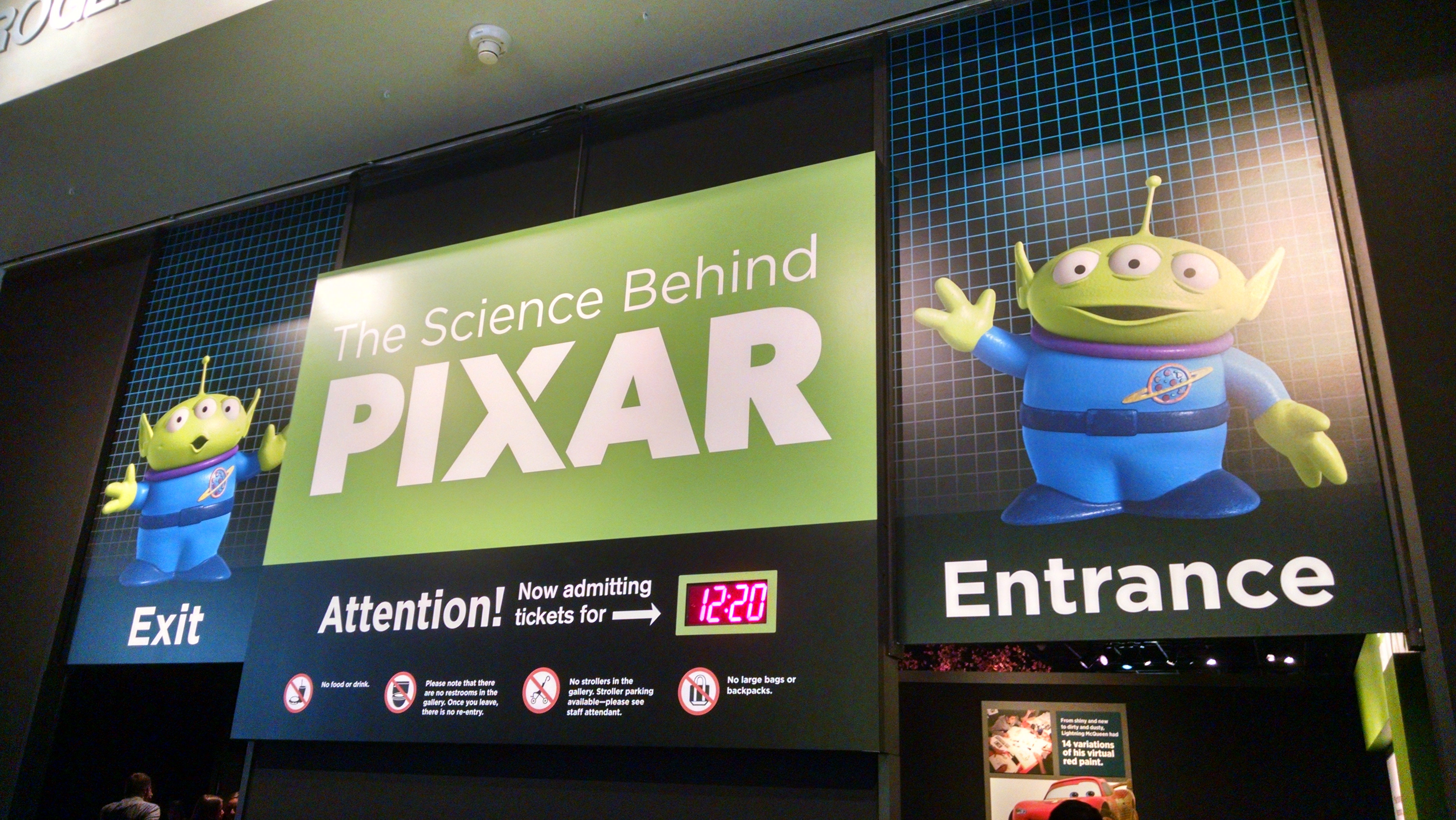
We did not enter at 12:20. We entered at 9:20, and this is when we were leaving.
I can never decide whether I love or hate timed-entry shows; as I’m usually an early-bird, it’s nice to know that I’ll have a little time with lots of space and chances to play with the interactives before things get crowded, but I am not sure how much it helps with traffic once the exhibit gets busy later. (Anybody know if someone’s done a crowd-pattern study on timed vs. untimed entry?)
There’s a lot to like initially on entry: there are a fun set of facts to read if you’re stuck waiting in line, and the entry movie is cool as much for the behind-the-scenes peek at the Pixar offices as it is for the intro to the steps of the computer-graphic-animated-movie-design process. (I especially loved the office that looks like the fuselage of an old plane wreck in the jungle.)
Once inside, as dark as the walls are, it still feels lightsome, as there are big gorgeous graphics of Pixar concept art all over, life-size models of various familiar characters, and brightly lit interactive islands throughout. I’m not a fan of the dark-hall design in general, so I was impressed at how not-dark this one was.
Logistical and Floorplan Choices
This is an exhibit that doesn’t really have an A-B-C flow; given the amount of bouncing around one has to do to find a free monitor or interactive once it gets busy, that’s a good thing. It is initially a little hard to figure out, but once you hit the ‘process in the round’ area that shows you how often elements of a movie move back and forth between the steps (from character design to rendering to animation to sets back to character design and then to lighting, for example), it makes the forth-and-back of the exhibit ‘map’ less troublesome.
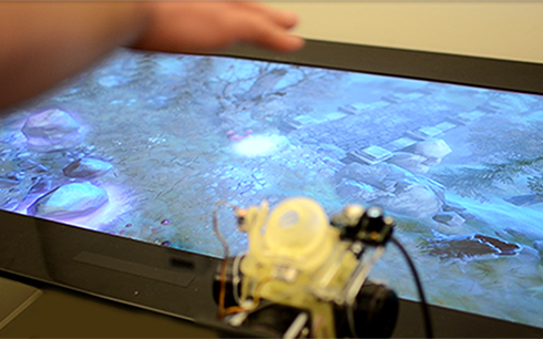
I’ll cover interactives in depth next, but from the logistical standpoint they made some excellent choices. Most interactives were in sets of 2-4, so that each island had multiple opportunities for people to play, reducing waiting time and also making the overall density of the exhibit less overwhelming (“oh, these three are all the same, good, I can move on to the next thing”). There was also nice variety in the interactives; some low-tech in amidst all the high-tech, some very simple and others quite complicated, some large-scale that made it easy for multiple people to see/interact together, and some that rewarded close individual attention. There was something to appeal to almost every kind of learner, and several things which were clearly designed with universal accessibility in mind.
Interactives
There were a number of choices I admired in the interactive design of this show. The digital effects were almost always paired with a nearby example of how such a concept works in ‘meatspace,’ and the controls were on the whole intuitive and remarkably sturdy. (I don’t want to know how much programming turns sliding knobs and a choice of less than 5 buttons into easily digestible visible changes on screen, but I am willing to be impressed even without knowing the ‘how.’)
All the screens were captioned, and all the signs had audio wands. Several of the interactives had tactile handles that were the physical embodiment of the shape you were generating on screen. In terms of design for accessibility, I thought this exhibit did really well.
The only time I thought their physical-embodiment of something being described on screen *didn’t* work was in the reconstruction of the coil-within-coil physics of Merida’s hair. The two sets of springs they modeled were equally non-springy, and didn’t really emulate the physics being illustrated at that station. I wanted some dangling slinkies to play with of different materials and construction, instead of standing coils that didn’t move. Otherwise, the physical/virtual pairings were quite impressive.

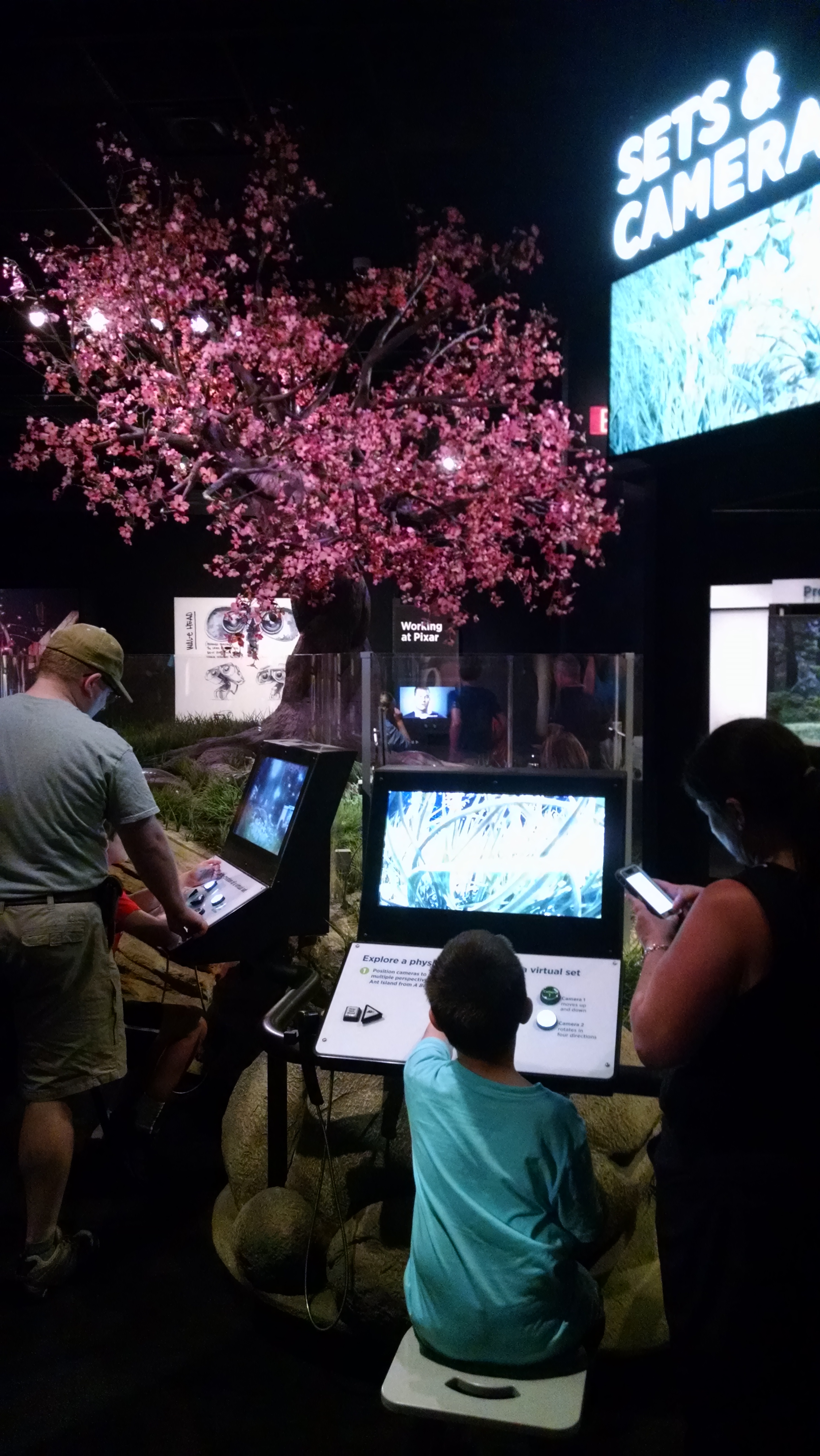
This station allowed you to play with camera angles from several different cameras, and also allowed you to physically climb underneath for a literal bug’s eye view of the constructed set. Simple, effective, great presentation value, and a nice way to tie in both the research Pixar did ahead of A Bug’s Life and the directorial choices available when all your cameras are virtual.

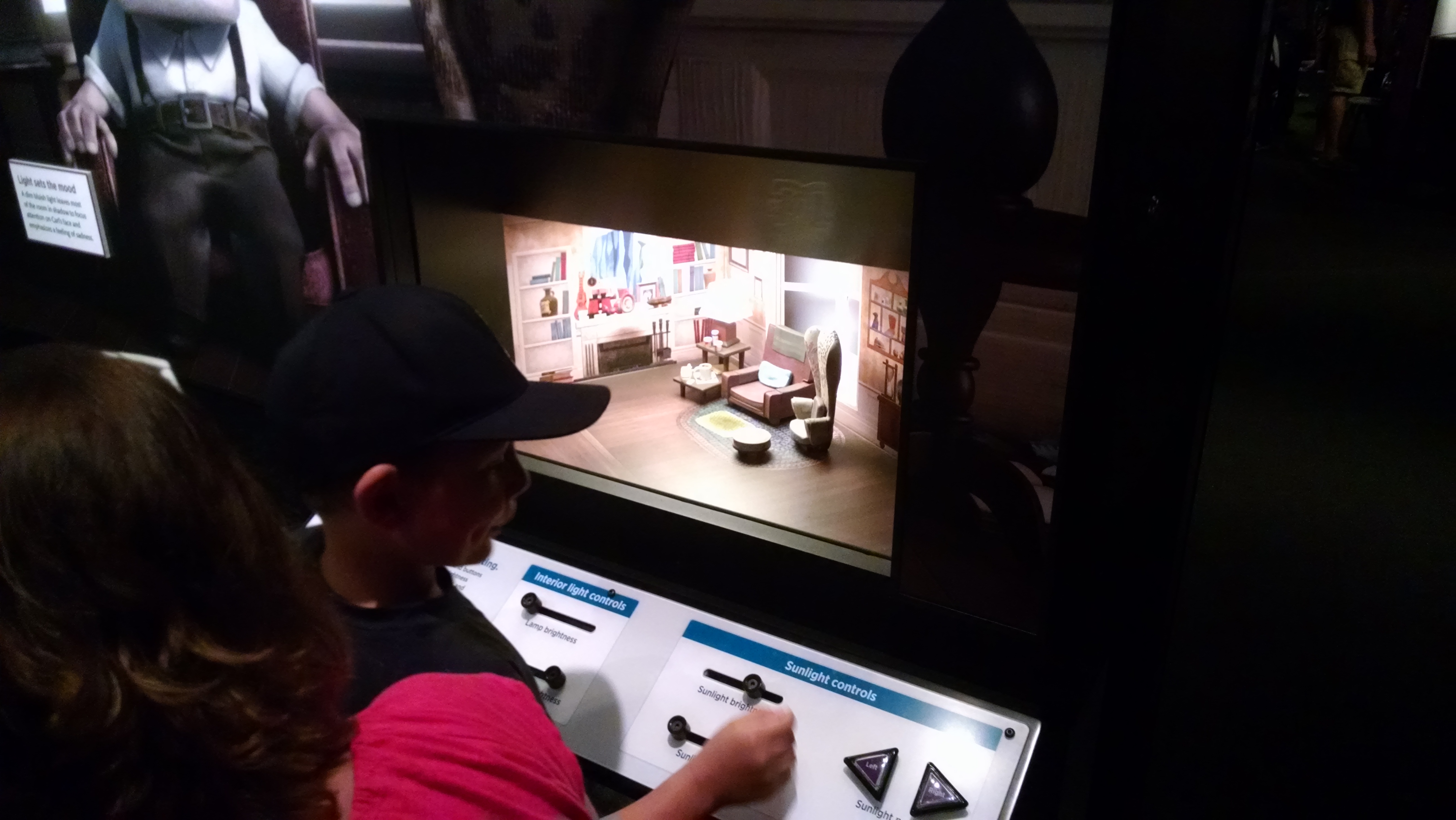
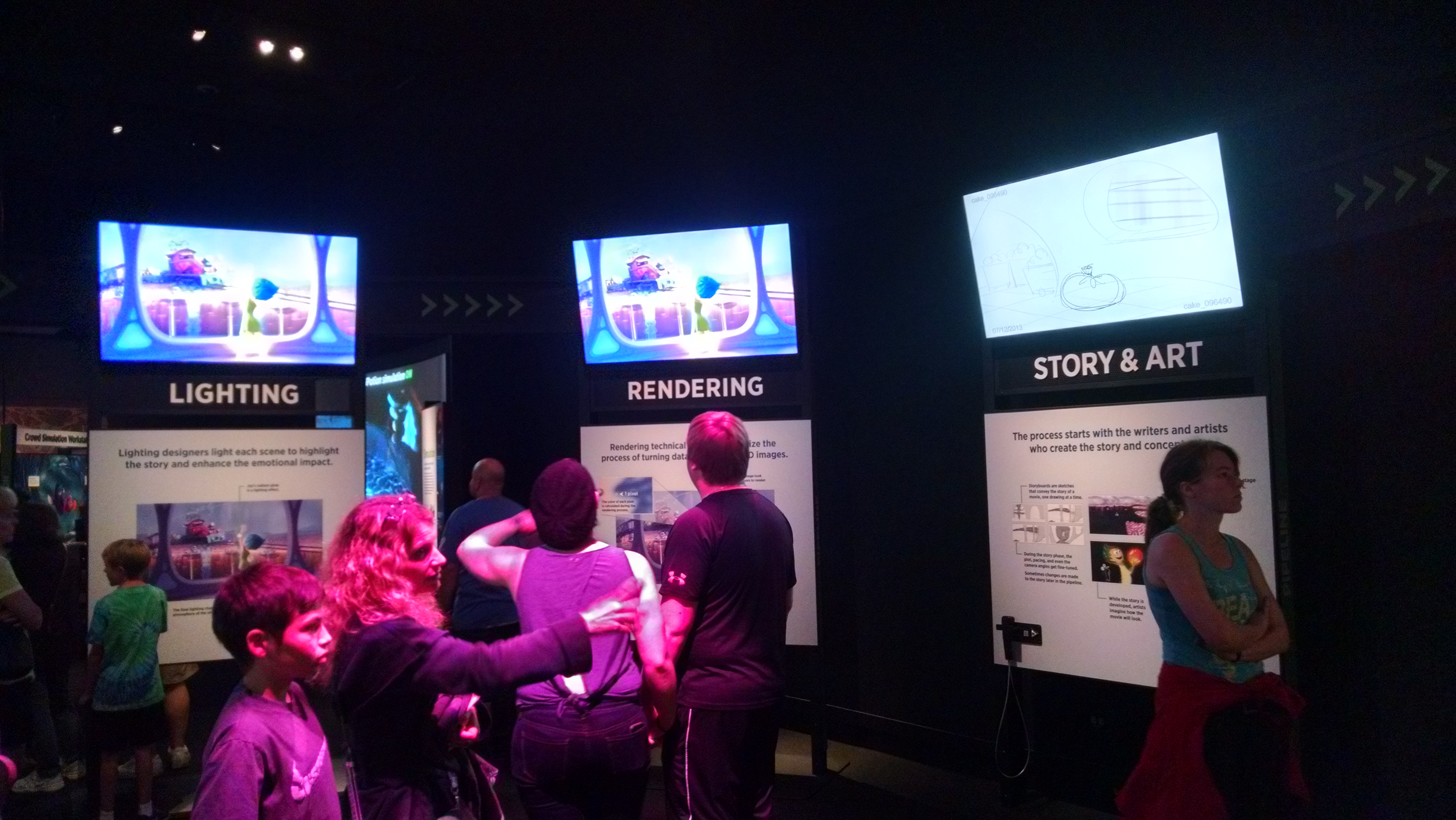
A recreation of the paper house that Pixar lighting designers created to test lighting of Carl’s house for Up. Behind this were digital interactives that let you play with the virtual lights the same way one could play with physical ones here. There was lots of cool context about the vocabulary of lighting design (ie ‘temperature,’ etc.) as well as the purpose (emotional effect, helping to pick out the main character in a scene, indicating transitions).

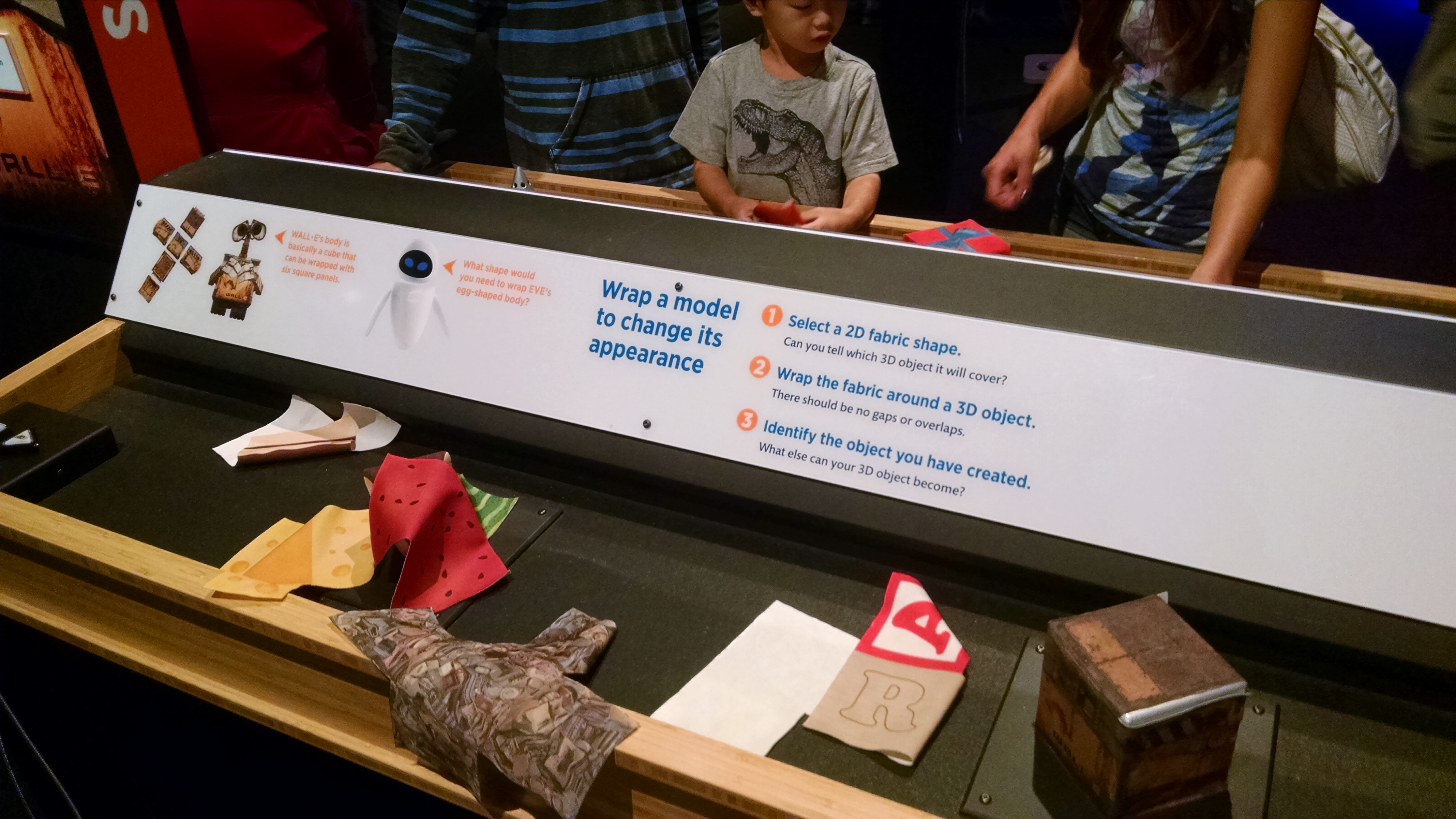
This was the low-tech version of mapping a surface onto a wireframe object. There was a very simple (frustratingly so, for adults) virtual interactive that allowed you to ‘paint’ a car hood with different projections, but I actually liked this better, for any number of reasons including the fact that different surfaces on the same shape create very different objects, and because it showed at least a little what kinds of deformations and folds you need to make in a surface texture when putting it on a 3D object.

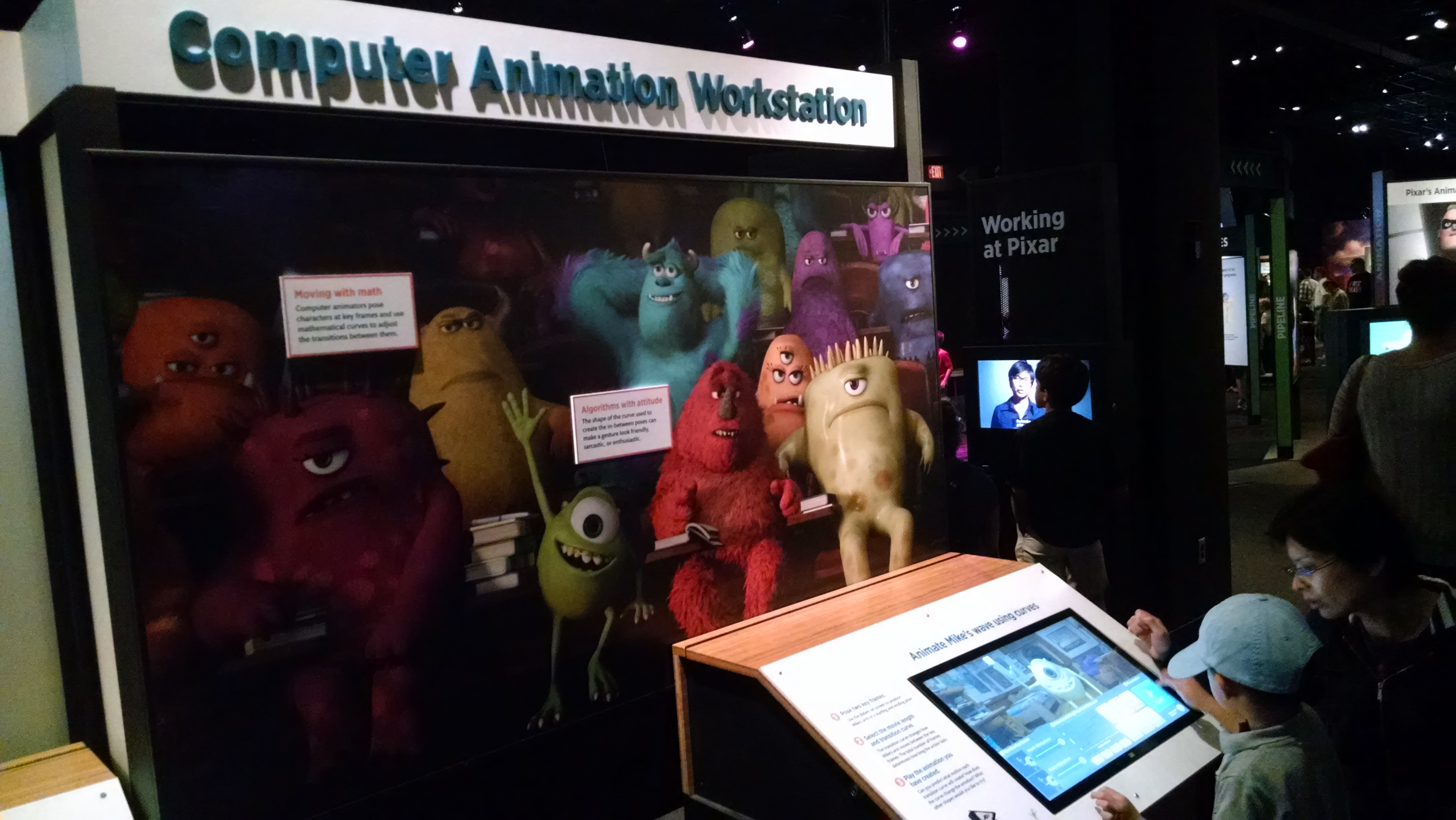
This animation station was one of the few where it helped to have paid attention earlier in the exhibit, to the ‘rigging’ section. It focused more on speed and range of motion, but was also influenced by the rules of how the character’s arm moved, based on the virtual bones and flexibility it had already been given.

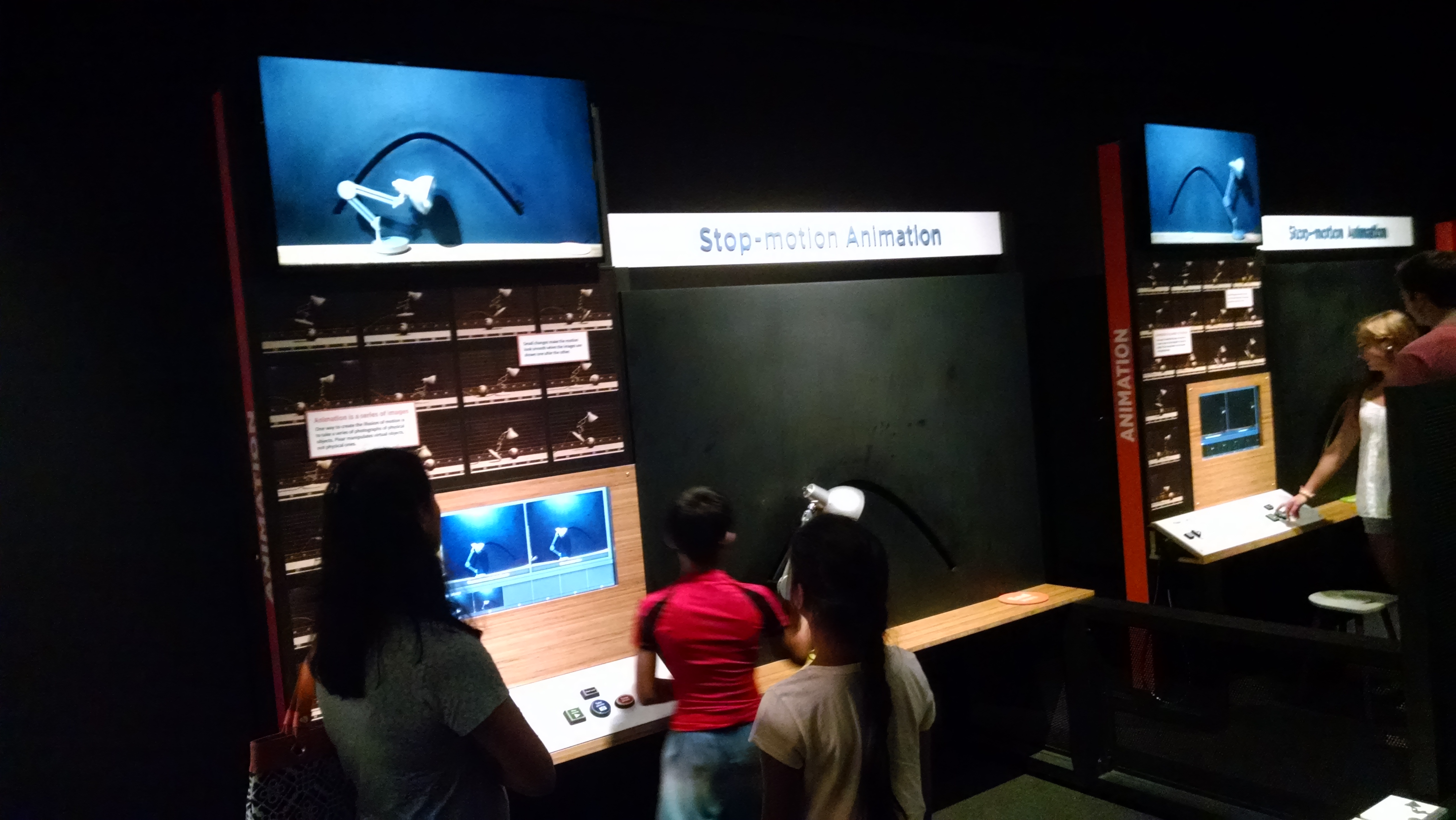
I loved this. It required teamwork, it had enough variability that even though the arc of the jumping lamp was prescribed, the attitudes and ‘energy’ of the lamp were all adaptable, and it led to a lot of discussion (albeit also some frustration from impatient parents). The replay function was also very satisfying, as your ‘movie’ was over very fast!

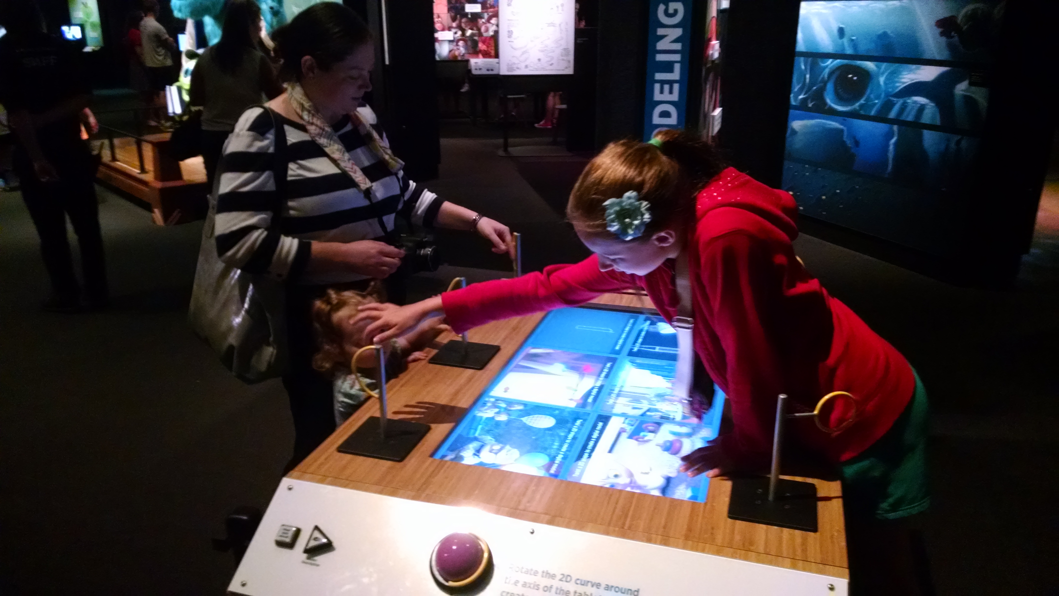
This was one of the interactives where I thought the handles for controlling the interactive were more interesting than the activity itself. Each handle was the same shape as the line on the screen which one rotated to make a 3D shape. Very clever!

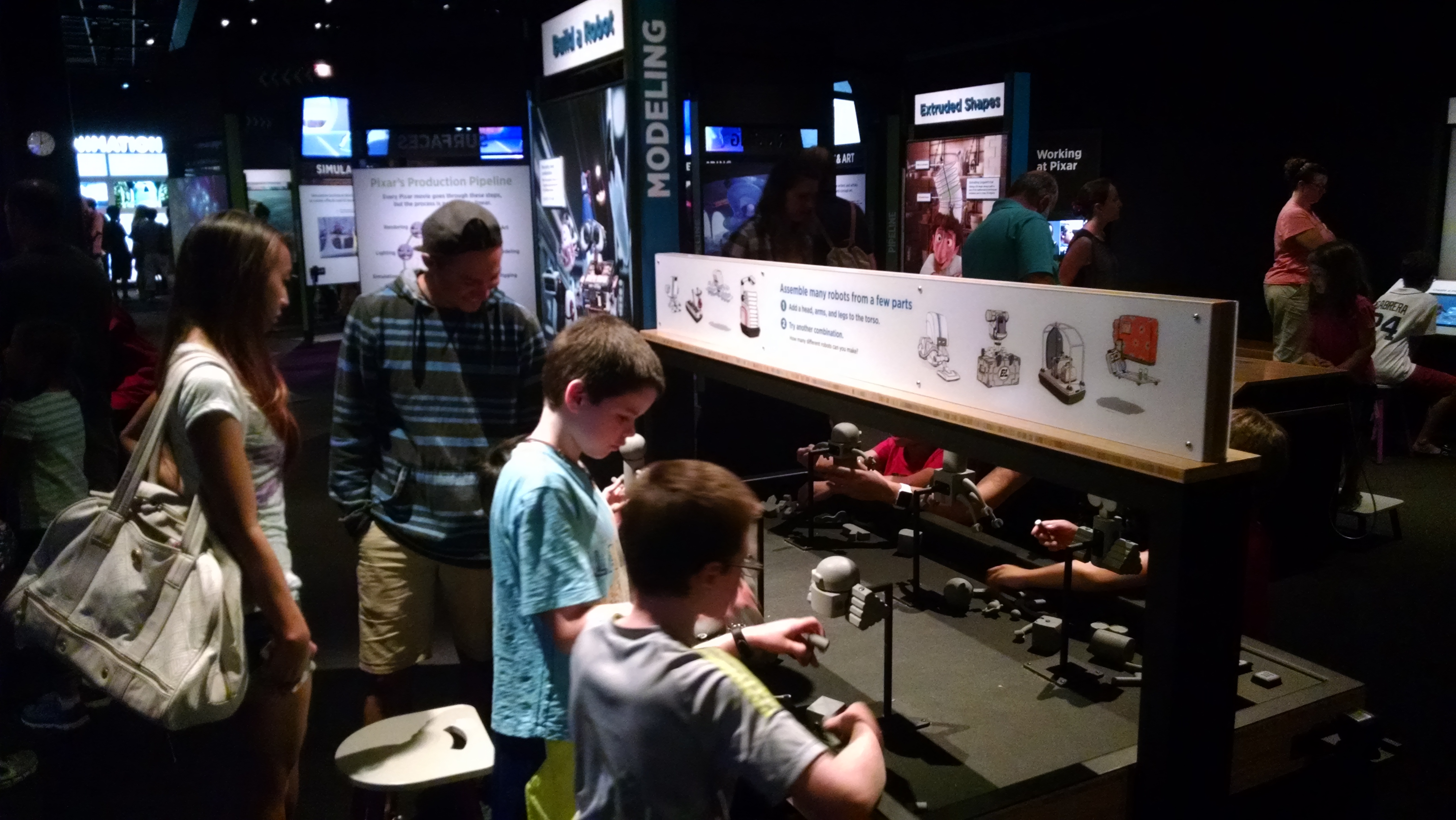
A simple and very familiar interactive (assemble magnetic body parts, this time for robots) with new context; using a certain number of base parts, Pixar designers could generate X number of unique robot combinations (and therefore how many can you?) Context is everything, and some good ideas stay good, even if they feel like they’ve been done to death.
Telling the Story
At heart, I’m a story person. Pixar is very good at story, of course, and fortunately, this exhibit does a pretty good job of it as well, especially in letting individuals who work at Pixar tell their stories. As much as I enjoyed the interactives (especially before it got too busy!), I really responded to the video interviews with people of all ages, ethnicities, and backgrounds who work at Pixar. They talked about loving or hating math at school, how they got interested in art or computers or both, their geeky hobbies, the ways their jobs and their coworkers inspired them, and generally put not just one human face on the movie making process, but dozens of them. It was adorable and inspiring and hilarious and eyebrow-raising in turns, and it made for good storytelling.
The process of creating Pixar stories, however, was a little muddled. The emphasis of this exhibit was more on the how-it-all-gets-built and not on how-it-all-begins or how-it-all-fits-together, but I did wish for a little more on the inspiration/imagination at the start of the process.

This circular exhibit element allowed you to track the evolution of a scene through the elements of the design and implementation process, but while visually engrossing was a little short on the ‘concept and storyboarding’ section.
A Few Lingering Wishes
The biggest thing missing from this exhibit, my traveling companions and I all agreed, was that there was no point at which they really addressed when and where sound was added, and how it was that that affected the design process. This was a very visual-heavy exhibit, but the visuals only tell part of the story, and we all wanted something that touched on the dialogue and music. How cool would it have been to be able to have a partner exercise where one person reads out and records a set of familiar lines, and the other person has to control the speed at which the character’s mouth moves in order to sync up with the words? What about pairing different lighting scenarios with different underlying music–what’s the difference between sad and creepy? Happy and manic? Dramatic and silly? The lighting might be similar, but the music sets the literal and figurative tone.
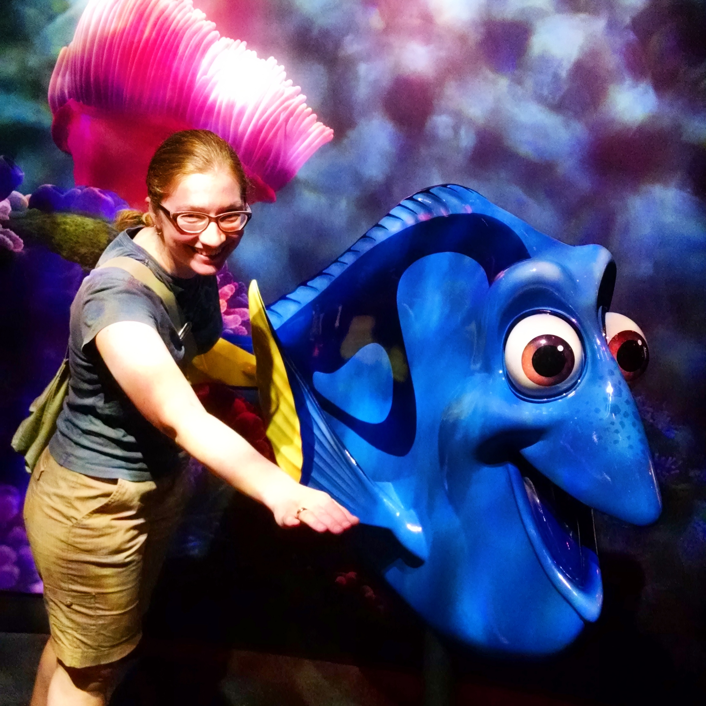
(Also, I wanted a full-size Merida to pose with. I settled for Dory.)

All told, it was a fun three hours, and I don’t think I’ll look at Merida’s hair, Nemo’s reef, or Wall-E’s post-apocalyptic trash heap the same, which is the mark of an exhibition well-done.
ETA: Another excellent behind-the-scenes exhibit write up can be found here, and it’s well worth the read.