A dose of wonder from DC’s museums

Have you been following the tag #5womenartists on social media? The National Museum of Women in the Arts has been running a challenge over instagram et al. to raise awareness of female artists during the month of March, and there have been a lot of neat posts from other museums as well as individuals (including artists themselves). I recommend checking it out if you have time.

When I was in DC at the end of last month for Museums Advocacy Day, I had a little free time, and naturally used it to tour museums (and the Library of Congress, because  librarian’s daughter).

Renwick Gallery (of the Smithsonian American Art Museum): Wonder exhibition review

The Wonder exhibit was a piece of colorful communal paradise on a rainy Sunday. Though I was operating on about four hours of sleep, I was completely enthralled with the show and went through it about 1.5 times because there were several installations I needed to spend just a bit more time with.

Each gallery in the recently restored Renwick was home to one installation, and my favorite thing about this tactic was how thoroughly it changed your experience of the museum from room to room. Patrick Dougherty’s Shindig Stickwork installation made for a mischievous, rambunctious audience experience, as people ducked in and around the swirling stick sculptures, peeking through windows and twirling between them in much the same kind of movement as the twigs themselves. Janet Echelman’s tsunami-inspired net sculpture and its corresponding rug was a much quieter experience, encouraging people to linger as the lights and shadows shifted, to lie down on the floor and just observe. Gabriel Dawe’s Plexus A1 was especially effective in its brilliance against the gray rain hitting the windows behind it; I did pity the guard stationed there who had to keep warning people not to get too close, because that rainbow of thread was as appealing a spider’s web as I’ve ever seen. It was hard to believe it wasn’t itself glowing, just excellent lighting. I admit I was less enthralled than many of the people I saw that day with the room entirely decorated with dead insects, and the sculpture out of tires, while texturally appealing, smelled distinctly of burned rubber and I couldn’t figure out if I was looking at a post-industrial dragon hide or a rejected piece of scenery from Mad Max: Fury Road. That said, the sheer variety of installations on view meant there was something for everyone.

I also found myself taking pictures of a bunch of the labels; not something I usually do unless I’m trying to remember an artist’s name, but the interpretation panels generally and the ‘wonder’ themed quotes they picked were exceptional. I love the idea of defining wonder as ‘a suprise of the soul.’

This slideshow requires JavaScript.

National Museum of Women in the Arts review

Firstly, major kudos to the visitor services team. The woman on duty at the front desk actually left her post to give me an extra suggestion and a gallery activity to take along, when I was partway into the galleries. Big points for being helpful and friendly! Said gallery activity was pretty interesting, too; I regretted that I was on my own and had no one with whom to discuss the questions posed for the various highlighted objects.

I had no idea this museum was as big as it is; I did a shamefully poor job on the top floor as I needed to catch my plane back to Boston. I will definitely need to go back. There were works by artists I recognized, and of course dozens upon dozens of works and artists that were new to me. It was a very good day for learning things, and for appreciating the breadth of the collection, from painting to photography to reinterpretations of materials and techniques in craft and design. The Pathmakers exhibit was much more interesting than I expected, in fact (though as with many design shows I found myself wondering for some pieces about where the function had gotten lost along the way to the form).

This slideshow requires JavaScript.

The museum has works of art created by women (and often featuring women) since the Renaissance. One of the things which most impressed me, as I suspect the balance was a fine one, was the tone in which the interpretation was presented. Labels, theme panels, etc. did not shy away from talking about the fact that women’s art was traditionally underrepresented in the Western canon, nor that women’s art was often influenced by the materials and roles generally assigned to them, nor that sometimes (especially in the 20th century) women’s art was directly related to political statements about women’s rights. However, these came across as statements of fact without seeming loaded, accusatory, or otherwise negatively charged. In a world that is increasingly emotionally and politically volatile, it was delightful, even restorative, to be somewhere that recognized, remedied, and celebrated instead. It was a great way to end my trip to DC.

Next week I’ll be hitting up historic houses and possibly the Wadsworth Atheneum in Connecticut, so stay tuned for some history-themed posts in the near future!

Exhibit Review: The Science of Pixar at the Museum of Science, Boston

I will freely admit I am a Pixar fan. I also volunteered once upon a when at the Museum of Science, back when I was in high school and didn’t know museums were eventually going to take over my professional life. I have to believe, however, that even if neither of these things were true, I would still be really impressed with this exhibit.

We did not enter at 12:20. We entered at 9:20, and this is when we were leaving.

We did not enter at 12:20. We entered at 9:20, and this is when we were leaving.

I can never decide whether I love or hate timed-entry shows; as I’m usually an early-bird, it’s nice to know that I’ll have a little time with lots of space and chances to play with the interactives before things get crowded, but I am not sure how much it helps with traffic once the exhibit gets busy later. (Anybody know if someone’s done a crowd-pattern study on timed vs. untimed entry?)

There’s a lot to like initially on entry: there are a fun set of facts to read if you’re stuck waiting in line, and the entry movie is cool as much for the behind-the-scenes peek at the Pixar offices as it is for the intro to the steps of the computer-graphic-animated-movie-design process. (I especially loved the office that looks like the fuselage of an old plane wreck in the jungle.)

Once inside, as dark as the walls are, it still feels lightsome, as there are big gorgeous graphics of Pixar concept art all over, life-size models of various familiar characters, and brightly lit interactive islands throughout. I’m not a fan of the dark-hall design in general, so I was impressed at how not-dark this one was.

Logistical and Floorplan Choices

This is an exhibit that doesn’t really have an A-B-C flow; given the amount of bouncing around one has to do to find a free monitor or interactive once it gets busy, that’s a good thing. It is initially a little hard to figure out, but once you hit the ‘process in the round’ area that shows you how often elements of a movie move back and forth between the steps (from character design to rendering to animation to sets back to character design and then to lighting, for example), it makes the forth-and-back of the exhibit ‘map’ less troublesome.

I’ll cover interactives in depth next, but from the logistical standpoint they made some excellent choices. Most interactives were in sets of 2-4, so that each island had multiple opportunities for people to play, reducing waiting time and also making the overall density of the exhibit less overwhelming (“oh, these three are all the same, good, I can move on to the next thing”). There was also nice variety in the interactives; some low-tech in amidst all the high-tech, some very simple and others quite complicated, some large-scale that made it easy for multiple people to see/interact together, and some that rewarded close individual attention. There was something to appeal to almost every kind of learner, and several things which were clearly designed with universal accessibility in mind.

Interactives

There were a number of choices I admired in the interactive design of this show. The digital effects were almost always paired with a nearby example of how such a concept works in ‘meatspace,’ and the controls were on the whole intuitive and remarkably sturdy. (I don’t want to know how much programming turns sliding knobs and a choice of less than 5 buttons into easily digestible visible changes on screen, but I am willing to be impressed even without knowing the ‘how.’)

All the screens were captioned, and all the signs had audio wands. Several of the interactives had tactile handles that were the physical embodiment of the shape you were generating on screen. In terms of design for accessibility, I thought this exhibit did really well.

The only time I thought their physical-embodiment of something being described on screen *didn’t* work was in the reconstruction of the coil-within-coil physics of Merida’s hair. The two sets of springs they modeled were equally non-springy, and didn’t really emulate the physics being illustrated at that station. I wanted some dangling slinkies to play with of different materials and construction, instead of standing coils that didn’t move. Otherwise, the physical/virtual pairings were quite impressive.

This station allowed you to play with camera angles from several different cameras, and also allowed you to physically climb underneath for a literal bug's eye view of the constructed set. Simple, effective, great presentation value, and a nice way to tie in both the research Pixar did ahead of A Bug's Life and the directorial choices available when all your cameras are virtual.

This station allowed you to play with camera angles from several different cameras, and also allowed you to physically climb underneath for a literal bug’s eye view of the constructed set. Simple, effective, great presentation value, and a nice way to tie in both the research Pixar did ahead of A Bug’s Life and the directorial choices available when all your cameras are virtual.

A recreation of the paper house that Pixar lighting designers created to test lighting of Carl's house for Up. Behind this were digital interactives that let you play with the virtual lights the same way one could play with physical ones here. There was lots of cool context about the vocabulary of lighting design (ie 'temperature,' etc.) as well as the purpose (emotional effect, helping to pick out the main character in a scene, indicating transitions).

A recreation of the paper house that Pixar lighting designers created to test lighting of Carl’s house for Up. Behind this were digital interactives that let you play with the virtual lights the same way one could play with physical ones here. There was lots of cool context about the vocabulary of lighting design (ie ‘temperature,’ etc.) as well as the purpose (emotional effect, helping to pick out the main character in a scene, indicating transitions).

This was the low-tech version of mapping a surface onto a wireframe object. There was a very simple (frustratingly so, for adults) virtual interactive that allowed you to 'paint' a car hood with different projections, but I actually liked this better, for any number of reasons including the fact that different surfaces on the same shape create very different objects, and because it showed at least a little what kinds of deformations and folds you need to make in a surface texture when putting it on a 3D object.

This was the low-tech version of mapping a surface onto a wireframe object. There was a very simple (frustratingly so, for adults) virtual interactive that allowed you to ‘paint’ a car hood with different projections, but I actually liked this better, for any number of reasons including the fact that different surfaces on the same shape create very different objects, and because it showed at least a little what kinds of deformations and folds you need to make in a surface texture when putting it on a 3D object.

This animation station was one of the few where it helped to have paid attention earlier in the exhibit, to the 'rigging' section. It focused more on speed and range of motion, but was also influenced by the rules of how the character's arm moved, based on the virtual bones and flexibility it had already been given.

This animation station was one of the few where it helped to have paid attention earlier in the exhibit, to the ‘rigging’ section. It focused more on speed and range of motion, but was also influenced by the rules of how the character’s arm moved, based on the virtual bones and flexibility it had already been given.

I loved this. It required teamwork, it had enough variability that even though the arc of the jumping lamp was prescribed, the attitudes and 'energy' of the lamp were all adaptable, and it led to a lot of discussion (albeit also some frustration from impatient parents). The replay function was also very satisfying, as your 'movie' was over very fast!

I loved this. It required teamwork, it had enough variability that even though the arc of the jumping lamp was prescribed, the attitudes and ‘energy’ of the lamp were all adaptable, and it led to a lot of discussion (albeit also some frustration from impatient parents). The replay function was also very satisfying, as your ‘movie’ was over very fast!

This was one of the interactives where I thought the handles for controlling the interactive were more interesting than the activity itself. Each handle was the same shape as the line on the screen which one rotated to make a 3D shape. Very clever!

This was one of the interactives where I thought the handles for controlling the interactive were more interesting than the activity itself. Each handle was the same shape as the line on the screen which one rotated to make a 3D shape. Very clever!

A simple and very familiar interactive (assemble magnetic body parts, this time for robots) with new context; using a certain number of base parts, Pixar designers could generate X number of unique robot combinations (and therefore how many can you?) Context is everything, and some good ideas stay good, even if they feel like they've been done to death.

A simple and very familiar interactive (assemble magnetic body parts, this time for robots) with new context; using a certain number of base parts, Pixar designers could generate X number of unique robot combinations (and therefore how many can you?) Context is everything, and some good ideas stay good, even if they feel like they’ve been done to death.

Telling the Story

At heart, I’m a story person. Pixar is very good at story, of course, and fortunately, this exhibit does a pretty good job of it as well, especially in letting individuals who work at Pixar tell their stories. As much as I enjoyed the interactives (especially before it got too busy!), I really responded to the video interviews with people of all ages, ethnicities, and backgrounds who work at Pixar. They talked about loving or hating math at school, how they got interested in art or computers or both, their geeky hobbies, the ways their jobs and their coworkers inspired them, and generally put not just one human face on the movie making process, but dozens of them. It was adorable and inspiring and hilarious and eyebrow-raising in turns, and it made for good storytelling.

The process of creating Pixar stories, however, was a little muddled. The emphasis of this exhibit was more on the how-it-all-gets-built and not on how-it-all-begins or how-it-all-fits-together, but I did wish for a little more on the inspiration/imagination at the start of the process.

This circular exhibit element allowed you to track the evolution of a scene through the elements of the design and implementation process, but while visually engrossing was a little short on the 'concept and storyboarding' section.

This circular exhibit element allowed you to track the evolution of a scene through the elements of the design and implementation process, but while visually engrossing was a little short on the ‘concept and storyboarding’ section.

A Few Lingering Wishes

The biggest thing missing from this exhibit, my traveling companions and I all agreed, was that there was no point at which they really addressed when and where sound was added, and how it was that that affected the design process. This was a very visual-heavy exhibit, but the visuals only tell part of the story, and we all wanted something that touched on the dialogue and music. How cool would it have been to be able to have a partner exercise where one person reads out and records a set of familiar lines, and the other person has to control the speed at which the character’s mouth moves in order to sync up with the words? What about pairing different lighting scenarios with different underlying music–what’s the difference between sad and creepy? Happy and manic? Dramatic and silly? The lighting might be similar, but the music sets the literal and figurative tone.

(Also, I wanted a full-size Merida to pose with. I settled for Dory.)

IMG_20150823_142732

All told, it was a fun three hours, and I don’t think I’ll look at Merida’s hair, Nemo’s reef, or Wall-E’s post-apocalyptic trash heap the same, which is the mark of an exhibition well-done.

ETA: Another excellent behind-the-scenes exhibit write up can be found here, and it’s well worth the read.

Museum Review: Fuller Craft, Brockton MA

This past weekend I took a trip (with my trustiest museum-going companions) to the Fuller Craft Museum in Brockton, MA.  It was my first trip there, and my overall impression was very favorable.  The museum has a lovely location overlooking a pond/reservoir, with wooded area around, and the building itself takes advantage of a lot of small courtyards and opportunity for natural light and indoor/outdoor sight lines.  It’s a very appealing space, though with a few drawbacks I’ll get back to later.  It’s a museum that deserves more attendance than it had the day we were there, for certain.

Here are a few highlights from our visit:

IMG_20141019_132125886

From the sculpture-laden courtyard/patio, overlooking the pond. Photo by Meg Winikates.

Game Changers: Fiber Art Masters and Innovators

“Fiber arts” can seem a pretty vague term.  What exactly counts as a ‘fiber?’  In the case of the Fuller’s exhibit, a lot: twigs, roots, aluminum strips and other metals, paper, plastic wire, the more expected silk, cotton, etc, and even leaves and ‘wasp nest fiber.’  It’s a variety that serves the exhibit rather than causing it to be too diffuse: the pairing of traditional techniques with unusual materials balances the use of traditional materials in fresh ways.  Understandably, I have a bias towards artworks that use natural materials (hello, job of 5 years), so a number of the pictures in the gallery below include tree materials, silkworm cocoons, etc. (There’s a full list of participating artists on the exhibition page if you need more information, too.)

This slideshow requires JavaScript.

All of us really enjoyed this exhibit: there were surprising moments, impressive examples of craftsmanship, visually engaging pieces, and beautifully textured ones that you just *really* wanted to get your hands on (though of course we all knew better).

Annette Bellamy’s Floating

Alaskan ceramicist and fisher-woman Annette Bellamy had a lovely one-room installation up through 11/2, which was the favorite of at least half of us in the group.  The two dominant pieces in the gallery were Floating and Sinkers, one of which featured a softly twisting and chiming set of ceramic kayaks, the other very pendulous, larger-than-life ceramic sinkers like the weights one finds on fishing lines and nets.  The lighting design in here was particularly nice, too, with the shadows of the kayaks offering the illusion of fish flitting beneath the boats.

IMG_20141019_125039078

The other part of this gallery that I really liked was a set of custom-adapted paddles, each inspired by a particular person or experience: a whale biologist’s paddle was shaped like a fin, a violinist’s like an abstract version of her instrument with curls of musical texture over it, a ‘phosphorescence’ paddle looked like coral and water bubbles, and Emily Dickinson’s featured buttons and lace.  As a gallery/installation, it was nicely designed and very effective.

Permanent Collection

The Fuller’s permanent collection exhibition space tries to do a lot in not a lot of room.  The intro panel mentioned four main thematic elements that guided the selection and groupings of objects, but there wasn’t a lot of room for those themes to be separated or further explained.  The strength of this set of galleries, therefore, was in the ‘eye-catchingness’ of particular objects or groupings, like the gorgeous seed-pod and flower-bulb inspired ceramics below.

IMG_20141019_125959957

Many of the works in this space were highly individual, often humorous, imaginative, and clearly made with a great deal of skill and imagination.  The density of display in some ways is an advantage, as it leads you naturally to compare and connect the pieces you are seeing in a single glance.

A Few Missed Opportunities

A craft museum is all about the work of an artist’s/craftsperson’s hands–the Fuller even emphasizes this idea by incorporating a fingerprint into their logo.  In such a museum, one would therefore generally expect to find interactive or touchable pieces.  With two exceptions, notable because they were the only ones (a book you could examine while wearing gloves and a weaving activity), this was not the case at the Fuller, and it’s a shame.

To be fair, I don’t believe the museum has a large staff or a gigantic budget, and they are certainly pressed for space, since many of their ‘galleries’ are in fact glorified hallways.  However, there were so many points where a small interactive (touchable ceramic tiles with varied glazes or bases, magnet board with re-arrangeable design elements, ring clip of textile varieties, etc.) would have really carried the day, it was a bummer not to see them.  I realize as a person who has spent the last 8 years in very interactive-heavy spaces I have a bias, but kids are not the only ones who are drawn to interactive experiences, and I was not the only one in my party who missed the opportunity to appreciate the art-making process in a more visceral way.

Also, labels with slightly larger font size (and on a few occasions a *little* less text) would be helpful.  I understand a lot of people don’t want to take attention away from the art, but it actually takes more of your attention to squint at a tiny label than to glance at a readable one.

That said, it was a great visit, a fun way to occupy a few hours, a nice quiet destination if you like your museums more meditative, and I recommend you make the trip to Brockton to check it out for yourself if you’re in the New England area.

Hello, My Name is Curiosity

To my extreme sorrow (and no doubt that of any number of my colleagues at PEM), our Museum Action Corps internship program is drawing to an end.  To celebrate some of the incredible work of the program’s coordinator, Rosario, and her many teams of impressive interns, I thought I would use a few BrainPopcorn posts to highlight my favorite recent intern projects.

Exploring Personal Connections Across Artworks, Curators, and Visitors

Exhibit openings usually have a number of common denominators: VIPs, staff with shiny nametags, refreshments, people mingling with more or less conversation focused on the art.  Maybe there’s some music, there are pretty much always a few minutes of speeches–it’s a fairly predictable pattern.

Which is why, when the museum staff was invited to an intern-created temporary exhibition event, “Connecting Cultures,” I was beyond pleasantly surprised to see the pattern rearranged.

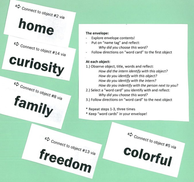
First, we were invited to pick up a name tag–not with our name on it, but instead with a noun we found appealing, or which we felt applied to us.  There were lots of choices: hard work, creativity, entertainment, emotion, etcetera.  Unsurprisingly, I chose

And with our name tag came an accompanying envelope with instructions and a slip of paper inside.  The instructions suggested that we consider and then do these things:

1) Why did you pick your name tag?  (Easy, that.  I don’t think they had ‘Hello, my name is Imagination’ or that would have been more of a battle.)

2) Find the artwork listed on our initial slip, talk to the intern who picked it, make connections between his or her experience and our own, as well as that of any other person visiting the artwork at the same time (This turned out to be very cool, as I learned things about my coworkers which would  never have come up in everyday conversation.)

3) Pick another word associated with that artwork from the group on the table and follow it to the object indicated.  Then think about how that word applied to both artworks.

4) Repeat step 2 until you’ve gone full circle or the time runs out and it’s time for speeches.

As you can see from my list, there were any number of neat themes to choose from: some had to do with the ideas expressed in each artwork chosen, others to do with the physical aspects of the artwork itself.  I did find myself redirected to the same object once or twice, so deliberately picked other words instead so that I’d have the opportunity to talk to different interns about their choices and experiences during the MAC semester.

My favorite take-away thoughts from this activity were these:

1) The level of staff or ‘visitor’ participation in this exhibit was very high, and conversations tended to be more on point than I’ve seen in some other intern exhibitions or final project presentations.

2) People tend to clump with others from their department or with whom they usually work closely, but the unusual name tags were a fun way to start a conversation with someone new.  (Or to stare surreptitiously and wonder why someone picked a certain term as their new ‘handle.’  Some were glaringly obvious, others were more of a head-scratcher, and that was fun.  It’s a great ice breaker and one I’d definitely like to re-use when I get an opportunity.)

3) Some of the staff members found the directions confusing or convoluted, presumably because they missed one of the group introductions to the activity which were provided by the interns themselves.  A little more signage outside the exhibit might have helped those who didn’t realize they had instructions in their envelopes as well.

4) The idea of ‘tagging’ a group of artworks with similar ideas or physical aspects would be a great way to talk about themes and looking at art with kids, either using examples from museums or their own artworks generated in class.

Review: Emperor Qin’s Terracotta Warriors at National Geographic Hall

Disclaimer: I totally love National Geographic.  You, my astute readers, will have figured that out already.

= = = = = =

My family and I spent the long weekend in Washington DC, enjoying a little respite from New England snow, and taking in (as one does, when one lives in a museum-mad family and works in a museum) the cultural sights.  Though I’d love to give detailed reviews of everything (kudos to the US Holocaust Memorial Museum, for instance, for a fascinating exhibit design in “State of Deception: Nazi Propaganda” which I wish I’d had more time to explore), I’m going to focus on the original impetus for the visit, which was National Geographic’s Terracotta Warriors: Guardian’s of China’s First Emperor.

Sadly, there were no pictures allowed inside the exhibition, so I have no photos of my own to share.  Fortunately, they bent the rules for their own bloggers, so there are some fabulous pictures of objects in the exhibition and at least some small sense of the layout available here.   One of the things I thought they did best in this exhibit was that each element was allowed its own space: the exhibit areas weren’t over crowded, which was important given how many people were trying to view them, and where two or three statues or other artifacts were placed together, it made sense and helped advance the ideas and context which the audioguide and interpretive panels were trying to convey.  It seems like a very basic and obvious thing to get right, but it’s noticeable in the traffic flow and the overall feeling and satisfaction of the visit if artworks or other objects are placed awkwardly.

There was a lot of overlap between the text panels and the audioguide, but enough difference that for the slow-paced intent studier like myself, it was worth listening and reading both.  I appreciated the context provided regarding the period especially immediately before the rise of Emperor Qin, but thought (as I have thought about many exhibitions before, including the MFA’s Tomb 10A exhibit) that it would have benefited from a timeline somewhere early in the exhibit, possibly also including reference points to western/European events of the same time period, to provide that extra hook for those of us who had largely Eurocentric history educations. (For the record, NG does apparently have a video segment not featured in the exhibit anywhere which mentions a little of what was going on in Rome at the same time period, which I’ve embedded below.)

Overall, however, I loved it.  I thought it was fascinating, the figures themselves were stunning displays of individuality and craftsmanship and technique, and the overwhelming impression that I left with was one of a man who commanded immense power and influence, and who, like many strong rulers in other cultures, created an infrastructure that allowed the arts to flourish.  Very cool.

(Video: A reconstructed flyover of what they think the complex around Emperor Qin’s burial mound would have looked like.)

= = = = =

More fun Chinese themed posts to come as we approach Lunar New Year, but for now I leave you with the events listing for Lunar New Year at the Peabody Essex Museum, which promises to be a huge amount of fun.